
A good higher education website design helps bring in new students by being easy to use, mobile-friendly, and clear. It should guide visitors with simple steps, keep them from leaving too soon, and build trust with honest content and a clean layout. Clear and easy-to-use sites matter more than flashy ones—and they can lead to more students signing up.
Key Takeaways
- First impressions count. A clean, sharp-looking college website helps build trust fast. It grabs the attention of students and their families right away.
- Keep it simple. A clear layout and easy-to-use menus help people find what they need—like programs or how to apply—without getting lost or confused.
- Design for phones first. Most people check school websites on their phones. Make sure your site works well on mobile and loads fast so visitors don’t leave.
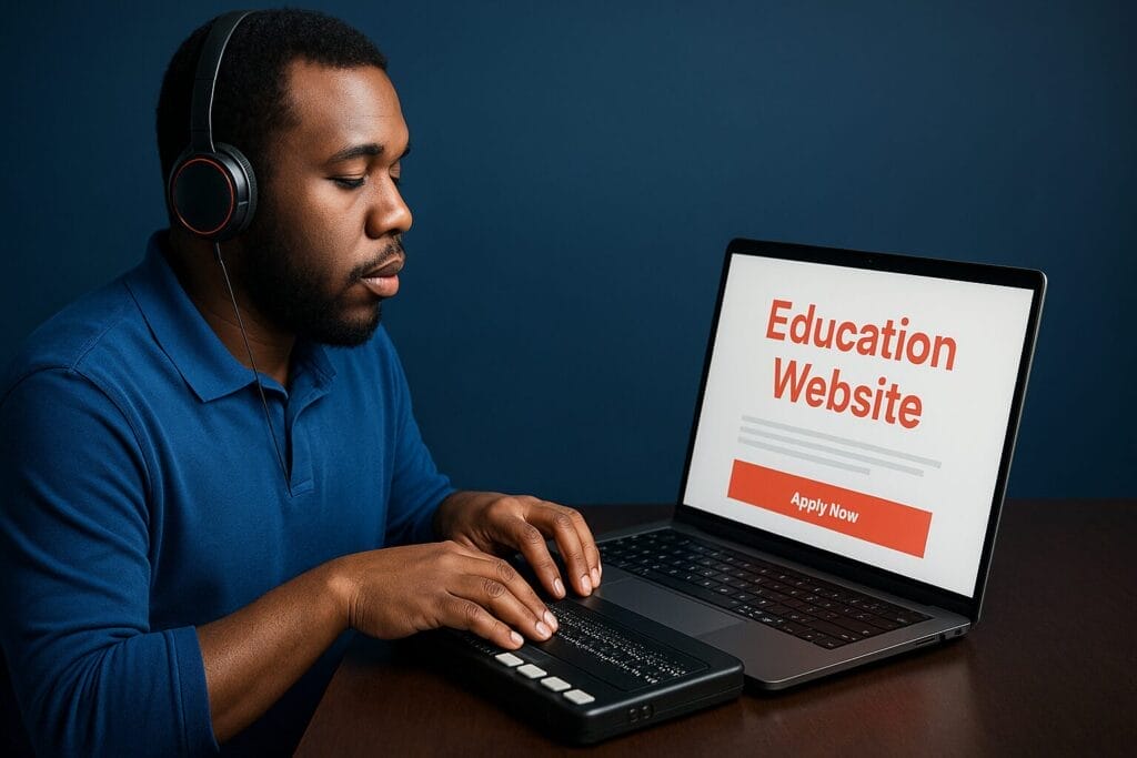
- Guide users to act. Use clear buttons like “Apply Now” or “Book a Tour” so future students know what to do next. This can help boost enrollment.
- Make your site for everyone. Use alt text, easy-to-read fonts, and offer other languages to make your site usable for all. This builds trust and brings in more people.
Why Higher Education Website Design Matters More Than Ever
What does your higher education website design say about your school in the first five seconds?
If “trustworthy, clear, and welcoming” didn’t come to mind right away, it might be time for a change.
These days, first impressions don’t happen on campus—they happen online.
When a family clicks your site, they’re at your digital front door.
If the homepage is cluttered, confusing, or hard to use, they’ll likely leave without taking the next step.
Today’s families want things simple.
They expect a site that’s easy to follow and doesn’t feel stuck in the past.
A clean, smart higher education website design does more than look good—it builds trust and shows your school is professional and forward-thinking from the start.
Your educational homepage website design shouldn’t feel like reading a textbook.
It should act like a helpful, easygoing guide: clear, quick, and made with the user in mind.
Schools that keep things simple and guide people toward the next step—like booking a tour or filling out a form—tend to see more clicks and higher enrollment over time.
The Power of Simplified Educational Homepage Website Design
In higher education website design, being clear isn’t optional—it’s a must.
Parents and students visit your homepage looking for quick answers, not a maze.
A simple educational homepage website design helps them spot key info—like how to apply, what campus life is like, and what your school stands for—without digging.
At Clickmill.co, we’ve learned that clean layouts highlight what counts: your school’s core message.
A busy page might seem packed with details, but it often hides your main point.
A clear, well-planned design lets your message shine.
When visitors can find what they need fast, they stick around—and they’re more likely to reach out.
We also suggest using fewer calls to action—no more than two per page.
Too many buttons? That just tires people out.
With fewer choices, users feel more sure about what to do next.
Clear CTAs like “Schedule a Tour” or “Apply Now” drive action and boost clicks.
In the end, good education website design cuts the clutter and makes actions simple.
A great site shouldn’t make people think—it should guide them to act.
That’s how you turn clicks into students.
Common Mistakes in Education Website Design

It happens a lot—schools hurt their online presence without meaning to.
In higher education website design, more isn’t always better.
Many schools pack their homepages with long blocks of text, too many dropdowns, old awards, and videos.
The result? Visitors feel lost, miss key info, and leave fast.
A good educational homepage website design should be clear and help users take the next step—book a tour, make a call, or start an application.
If your homepage tries to do too much, it does nothing well.
Using too many fonts, too many buttons, or too much content makes your message weaker, not stronger.
Another big mistake is not making the site mobile-friendly.
Most parents and students are on their phones.
If your site is slow or doesn’t work on a small screen, they’ll leave before they even scroll.
The best education website design blends good looks with easy use.
Keep the layout simple, focus the content, and highlight one or two key actions per page.
Don’t chase complexity—it won’t bring in more students.
Simplicity will.
Prioritizing User Journey Over Aesthetics
In educational homepage website design, it’s simple to get caught up in flashy features and overload your site with campus life details.
But parents and students don’t want to click through a maze—they want fast, clear answers.
When someone lands on your site, they’re starting a possible journey with your school.
That path should be smooth and easy to follow, not confusing or cluttered.
We talk to school leaders all the time who care deeply about their school’s brand—and they should.
But strong education website design isn’t about stuffing every inch with awards and long stories.
It’s about building a clean route from first interest to taking action.
That means clear page names, an easy-to-use menu, and no more than two calls-to-action per page.
More than that, and people often freeze instead of moving forward.
When we build with user intent in mind, we focus on one key thing for each page: “What should the visitor do next?”
Whether that’s booking a tour or asking for more info, our goal is to keep the next step obvious and simple.
Want your school’s site to bring in more enrollments? Talk to Clickmill today.
Mobile-First Design for Universities and Private Schools
Let’s face it—everyone uses their phone.
That includes parents checking out your school during a game and teens browsing between study sessions.
That’s why mobile-first design isn’t just nice to have—it’s a must for solid higher education website design.
We’ve seen schools overload their sites—too many links, too much text, and too many choices.
Mobile-first isn’t just about screen size—it’s about keeping things simple.
Your site should work smoothly whether someone’s on a phone, tablet, or laptop.
Clear layouts, easy-to-read text, and simple menus should guide visitors without the need to pinch, zoom, or guess where to click.
Most families we work with start their school search on their phone.
If your homepage is slow or packed with clutter, they might never reach the tour sign-up or application page.
That’s why educational homepage website design should be clear and quick from the first click.
Going mobile-first doesn’t mean cutting out key info—it means cutting the fluff.
A strong education website design makes its point fast, sticks to one or two main actions per page, and keeps the design clean with no more than two fonts.
If your site is too complex, users will back out.
Build with mobile in mind, and you’ll meet people right where they already are.
Branding Through Simplicity
In higher education website design, less is often more.
We know your school has a long past, strong programs, and great staff—but cramming all that onto your homepage won’t help your visitors.
Simple design doesn’t mean skipping key info.
It means making it easier for people to find what matters.
White space isn’t wasted—it gives the page room to breathe.
It shows focus and builds trust.
It tells visitors, “We know what’s important, and we won’t flood you with too much at once.”
Your educational homepage website design needs to do more than look neat—it should show off your school’s voice and style.
Use a clear color scheme, stick to just one or two fonts, and keep a steady tone across your site.
When done right, these details help your brand feel strong and your message stay clear from the first click.
At Clickmill.co, we often see school teams overthink and clutter their websites.
However, employing education website design aesthetics is crucial for homepages to effectively guide each user to the next step.
Design with purpose.
Keep it clean.
Focus on what helps future students and families—not just what checks a box for your team.
Features That Actually Matter on Higher Ed Websites
Let’s be real—when working on a higher education website design, it’s easy to want to add everything, from your school motto to years of student news.
But when there’s too much going on, the things that really matter get lost.
And that can turn people away instead of pulling them in.
So, what matters most?
Clear info and a real connection.
A simple site layout should help people find admissions info in two clicks or less.
Your educational homepage website design should make it super easy for parents to get what they need—without having to guess or dig through confusing menus.
Use tools that help people make choices, like calendars that show campus events and deadlines.
That not only helps with planning, it shows your school is organized and upfront.
Features like real-time chat and easy inquiry forms let visitors get answers fast, without feeling pressured.
With your education website design, cutting down the clutter works better.
Keep it clear, keep it sharp, and lead users to take action.
Don’t try to show off everything.
Show what really counts.
People don’t want a wall of info—they just want to know what to do next.
So help them do that.
There’s one thing many schools overlook: the data.
We track how users move through the site to see what works and what doesn’t.
With regular updates, your site can shift from a digital flyer to a real conversion engine.
Accessibility and Compliance in Education Website Design
In higher education website design, access is not a bonus—it’s a must.
Your site should work for everyone.
That means people who use screen readers, browse with a keyboard, or read in a second language.
This isn’t just good to do—it’s the law, like under the ADA.
We build digital spaces that all future students and their families can use with ease.
That means adding alt text for images, using strong color contrast for easy reading, and picking clear, simple fonts.
The goal is simple: no user should have to work hard to read your site or find what they need.
If your school serves global families or speaks to more than one language group, it helps to have multilingual support.
This makes your site more open and easy to use for more people.
Educational homepage website design should do more than look nice.
A site that’s easy to use affects big choices—like setting up a tour or applying.
When your site is built for access, it shows your school cares about all users.
Our education website design approach doesn’t just check boxes—it opens doors.
A school that aims for the best should have a site that proves it to every visitor.
Leveraging SEO to Increase Website Visibility
In higher education website design, SEO isn’t just tech talk—it’s how people find you online.
Even the best-looking site won’t help if no one sees it.
To grow enrollments, your site needs to show up in search results.
That’s why we build websites that look great and work well with Google.
A big win comes from using search terms like “private Christian school near me.”
These are the exact words parents type when looking for a school close by.
Add clear page titles, smart headers, and solid links within your site, and you don’t just show up—you stand out.
We also use an SEO-first content plan.
Writing blog posts about topics parents and students care about can help push your site up in search rankings and keep it there.
It’s not about chasing fads.
It’s about giving real answers to real questions.
That makes your school look trustworthy online.
Just as key, good SEO starts with smart education website design.
That means pages load fast, work on phones, and are easy to move through based on how users browse.
Without a clear SEO strategy, your site stays quiet and unnoticed.
We’ll help you boost your presence and reach families already looking for what your school has to offer.
What SEO methods has your school used to boost online visibility?
Building Trust Through Transparent Website Content
In higher education website design, being clear gives you an edge.
Even the best academic program can get lost in a messy, hard-to-read site.
Many schools make things more complex than they need to be.
That confusion can hurt trust, drop interest, and lead to fewer enrollments.
A solid website builds trust by showing key info in a clear, straight-to-the-point way.
This doesn’t mean cutting out the important stuff—it involves an educational homepage website design that respects your visitor’s time.
Students and parents want to see your programs, know how to apply, and learn about the people teaching.
That’s it.
So cut the clutter and highlight what matters.
Your educational homepage website design should guide visitors with ease using no more than two clear calls to action.
Want them to book a tour or start an application?
Make that step clear.
Use clean sections to show off staff skills and what makes your school stand out.
Put your best features where people can see them fast.
In the end, a clear and honest education website design builds trust—and trust helps turn visitors into students.
A smart higher education website design keeps things lean.
Stick to one main goal per page.
Use one or two fonts, max.
And don’t add more than two calls to action—usually “Schedule a Tour” and “Apply Now.”
These aren’t just random tips.
They help cut down on confusion and move users to act.
Integrating Digital Advertising With Website Design

Let’s be honest—if your digital ads and your school site don’t match up, you’re wasting time and money.
In today’s crowded education space, ads only work well if they lead to the right kind of page.
That’s why smart higher education website design is a must, not a maybe.
When someone clicks on a Google or Facebook ad, they expect to land on a page that matches what the ad said.
If the page feels off or says something different, people get confused and leave.
To fix this, we make sure your landing pages match your ads in tone, words, and look.
When everything feels connected, people trust your message and are more likely to act—like booking a tour or asking for more info.
It’s key to make the path through your site clear.
Keep each page focused on one or two actions.
Put buttons—like “Book a Tour”—where they’re easy to see, and make sure the rest of the page supports that goal.
A clean, focused layout always beats a messy one.
Another big tip?
Keep it simple.
One common mistake is stuffing a page with too much info.
If there are five fonts, too many CTAs, and chunks of dense text, users won’t stick around.
Each page should focus on one goal, one message, and one step you want the user to take.
We also use tools like heatmaps and analytics to see how people interact with your site.
This helps us tweak your education website design so it works even harder for you.
Your site shouldn’t just sit there—it should help make every ad dollar count.
At Clickmill, we make sure your site doesn’t just get traffic—it turns visits into results.
Whether you’re focused on educational homepage website design or overall web strategy, we help you make every click count.
Avoiding Over-Design in Educational Web Projects
Let’s be real—some higher education website design projects go too far.
It’s easy to get wrapped up in flashy effects, fancy graphics, and too many extras that make your site feel more like a theme park than a school.
But here’s the truth: more isn’t better.
Better is better.
When we build sites for private schools, we put function first.
Every part of your site should have a purpose.
Images? Sure, but only if they help tell your story.
A strong hero image that shows your mission? Great.
A looping video that doesn’t add anything? Not needed.
Educational homepage website design should be simple and clear.
Stick to one headline.
Two fonts, max.
Your menu should guide users like clear signs—not make them hunt around.
And with buttons, don’t go overboard.
Two per page is just right: one main, one backup.
That’s all you need.
Clear sites get more clicks.
Busy ones send people away.
Whether you’re building an education website for a preschool or a university, a clear and effective higher education website design usually works best.
Keep the design clean, focused, and made for your users—and your site won’t just look nice, it’ll work how it should.
And that’s what really matters.
Frequently Asked Questions Section About Higher Education Website Design
A strong higher education website design is clear and easy to use. It shows who you are, what your school offers, and what users should do next. Families and students don’t like clutter, so keep things simple. Good education website design means clean pages, easy-to-follow menus, and language that’s straight to the point. Each page should have a goal—and that goal should be clear. Trust helps too, like listing your faculty’s skills or your school’s accreditations—but don’t overload users with too much info. Make it simple, guide the way, and lead users to act.
Your site should always feel alive—not like an old brochure. Check your educational homepage website design every few months and update it when things change. Calendars, staff lists, and programs need to stay current. Make sure events and news are fresh so families see a school that’s active and welcoming. Even small changes to how the site works or how calls to action are shown can lead to more interest and more sign-ups. Think of your site like your campus—it should always be ready for guests.
SEO helps your higher education website design show up on search engines. It helps people find your school when they search online—like “private Christian school near me.” Conversion optimization kicks in once they land on your site. It helps turn clicks into action, like booking a tour or applying. Both matter. SEO gets traffic to your site. Conversion makes that traffic count by turning interest into results.
What other questions do you have about improving your higher education website design to make it work better for your school?

Responses