Church graphic design involves creating visual content that reflects your church’s mission and improves communication. Having a media graphics strategy is key to engaging your congregation and attracting new members. Start by understanding your church’s brand and message. Learn the basics, like color theory, typography, and layout. When done right, church graphics are a valuable investment that can boost your outreach. Use affordable tools like Canva and Adobe Spark to create impactful designs without breaking the budget.
In a world full of advertisements and competing messages, beautiful church graphic design keeps you from getting drowned out. People are more drawn to beautiful things than they are to meaningful things.
By utilizing church graphic design, you can make something that is both beautiful and meaningful.
“If only some churches realized there’s more to communicating the gospel than a sermon on a Sunday.” – Elizabeth Webster.
In this article, we will not only discuss why church graphic design is important, but we will also teach you the basics so you can apply it to your church media.
Let’s dive in.
SECTION 1: What Is Church Graphic Design
When you think of church graphic design, do artistic sermon booklets, social media posts, and bulletin covers come to mind?
While these examples certainly fit under the church media graphic umbrella, the term encompasses a lot more.
Examples of church media graphics also include:
- Church media posters
- Church book covers
- Church gifts, such as pens and mugs
- Church logos
- Church signs along roads and sidewalks
- Church website layouts
…and the list goes on. All this goes to show that whether you notice it or not, church graphic design is involved in many areas of your ministry.
So, what is graphic design?
The American Institute of Graphic Arts (AIGA) defines graphic design as:
“The art and practice of planning and projecting ideas and experiences with visual and textual content.”
In other words, church graphic design is a method of communicating ideas visually.
These designs can be as simple as the logo of your church, or as complex as the layout of your church website page. Christian graphic designers combine visual and textual elements to connect the church to its audience.
But professional designers aren’t the only ones who can do this–you can too. Let’s go over why you should take the time and effort to make effective graphic designs.
SECTION 2: Why Should You Have A Church Media Graphics Strategy?
“One of the main jobs of the church, if not the main job is to communicate – church graphic design helps us do that well.”, – Rebecca Harris.
“Churches need to realize the value that communication through design can bring to the table.” – Jordan Gillman.
A good design drives your message home. A message can resonate with someone intellectually, but it only becomes truly memorable when it resonates with them emotionally.

Here are four reasons why you should build a professional church media graphic strategy to make an impact on your audience:
#1. Visual Content Wins Over Text Every Time
Like it or not, we live in a visual world. Studies show our brains process visuals 60,000x faster than text.
Because of the way our brains process information, images can be used to amplify text.
Church Mag says,
“Graphic design can be a megaphone for the Truth that is being taught or conveyed.”
Visuals make a bigger impression on people than plain text. This is why it’s essential to have a church graphics strategy in place.
If you are enjoying this post – you will really love our ultimate guide to church marketing titled, Digital Marketing For Churches: #1 Church Marketing Guide.
#2. Christian Graphic Design Draws Attention
Because people connect with visual messages quicker than textual messages, we can draw their attention more effectively with beautiful church graphics.
Church Mag recommends that you “catch and hold people’s attention long enough to convey the truths according to Jesus.”
When you use church graphic design properly, you can hold your audience’s attention longer and communicate the messages that matter most.
#3. Christian Graphic Design Showcases Your Church’s Benefits
Church Media Graphics are all about showing people why they should come worship at your church.
It’s also about showing people what your ministry can do for them.
In marketing, a clean and simple graphic design can help the audience quickly understand how a product or service will make their life better.
As a ministry leader, you may not be selling products, but you are offering services to your community. You can transform people into life-long believers through these services, which may include Sunday morning worship, bible studies, children’s ministries, counseling, prayer, homeless outreach, etc.
Presenting your services in an organized, well-thought-out design can help your audience to quickly understand the personal benefits of joining your church.
“Church media graphic design speaks the international language and transcends borders. Churches should leverage it to the max.” – Steve Fogg.
#4. Christian Graphic Design Creates Emotional Bonds
You’ve probably heard the phrase,
“A picture is worth a thousand words.”
Powerful images speak to us emotionally – especially when those images have to do with our deeply felt needs.

Church graphic design is about people’s experience and relationship with your ministry. An effective design can help connect people (your audience) to a place where their needs will be met (your church).
For example, if your community has a deep need for safety, healing, or support, you might use calming colors to communicate with your audience (think blue hospital signs).
The best designs are tailored to connect with the emotions and needs of the audience, which is why it is absolutely necessary for you to have a good understanding of your audience as you go into church graphic design.
If you haven’t already, this article will help you find your audience: Building An Effective Ministry: Why You’re Not Connecting With Your Ideal Church Audience
Here are a few questions to guide your church graphic design process:
- What is your audience’s biggest problem?
- What is your audience missing?
- What colors and images speak to the resolution of those issues?
Get A Proven Marketing Plan That Increases Enrollments When You Book A Call Today!
Receive customized advice to help your school attract more families!
In the coming section, we’ll take you through the basics of church graphic design.
SECTION 3: The First Step Of Church Graphic Design
The first step of church graphic design is to identify your church’s vision and what makes it unique.
Your church’s vision is closely tied to your target audience and their deepest needs, because the vision is what the world will look like after you have reached your audience and met their needs.
In other words, the vision is the specific goal that your church is called to. When your church has a clear, attainable goal, the people around you will be motivated to take action.
Here are a few questions that will help you clarify your church’s vision:
- What is my church’s mission statement?
- How can my church solve the audience’s problems and meet their needs?
- What are the 5 most important values in my church?
- How do I want my church to be known and remembered?
- How would my community describe my church?
- How do I want people to think of my church? (Like a friend, a father, authoritative, serious, fun, modern…)
After addressing these questions, you’ll begin to uncover the core values that should be reflected in your church graphics.
You should also discover what sets your church apart from other churches.
Of course, churches aren’t competing with one another for an audience, they’re working together toward the common goal of discipling the nations. However, each individual church has a unique part within that common goal, and it is important that you find what makes your church unique to more effectively reach your niche audience.
Just as there are people that other churches are better equipped to reach than your own church, there are some people that your church is best suited to reach.
Identifying your church’s vision and what makes it unique will help you to define your church’s brand–the way that other people perceive your church.

Having a strong brand identity makes your church more memorable and increases your opportunities to make an impact on people’s lives. On the flip side, having a scattered, unclear brand identity makes it more difficult for your church to connect with people.
So how do you create an effective brand for your church?
To create impactful church media graphics, you must be 100% authentic.
It can be tempting to copy other ministries or use designs you find online because it’s easy.
However, you shouldn’t dress yourself up as a church that you’re not. If your ministry isn’t careful, it may end up with an image that is inconsistent with its values and come across as inauthentic..
People can sense inauthenticity from a mile away.
If your audience doesn’t believe your church graphics messaging really represents who your ministry is, they won’t trust your future church communications.
If you’re not sure who your church is, check out our article: How To Grow A Church: 10 Best Biblical Church Growth Strategies. In that post we discuss how to get to the core identity of your church and build on it to create sustainable church growth.
Instead of replicating other churches, you should clearly present who you are and what your ministry stands for. Center your designs around your audience, their needs, your church, and its vision.
Everything you put out in your community reflects your church’s brand, so all of it must be consistent.
Consistency is doing the same thing repeatedly over a long timeframe.
When church graphic design has a consistent appearance, your community will be more inclined to trust that your ministry is just as consistent.
A consistent ministry adheres to the same principles steadfastly and unwaveringly. God is consistent, and He expects us to maintain a consistent and faithful lifestyle.
In the same way that we depend on God’s consistency in our lives, your community must be able to depend on your church.
That’s why it is important that your ministry’s consistency is reflected in all of its church media. One way to make this process easier is by using a style guide.
A style guide is an agreed-upon set of standards to use when creating any form of church graphic.
A church style guide should include the following:
- Color palette
- Title font
- Normal text font
- Call to action button color
If you don’t have a style guide yet, you should come up with one as you incrementally transition to standardized church graphic design should be incremental.
Shift your style guide as needed if your target demographic or the core needs of your audience change over time.

Get A Proven Marketing Plan That Increases Enrollments When You Book A Call Today!
Receive customized advice to help your school attract more families!
SECTION 4: The Basics Of Church Graphic Design
The style guide isn’t the only church graphic design technique that you will be learning in this article. Now that you have an idea of what messages you want to convey to your audience, let’s look at what you need to know in order to make that into a design.
Every design–from the best to the worst–is made up of certain elements. Whether your design falls into the former or latter category is determined by how you use these 8 elements:
- Color Theory
- Typography
- Shape
- Imagery
- Texture
- Composition
- Contrast
- Unity
In this section, we will go over the first 5 elements, because they act as the building blocks for the final 3 elements, which we will include in the next section.
- Color Theory
Color theory is the art of choosing specific colors for your design. However, the difference between an amateur and a professional is how those colors are chosen. An amateur would choose colors based on a vague feeling that they look nice together. This only works when the designer has good intuition, which is not always the case. So how do professionals choose colors for their designs?
A good graphic designer considers the meanings and emotions that certain colors are associated with, and picks whichever colors will resonate with the feeling they want their audience to have about their brand.
You may remember the example of blue hospital signs from a previous section. Hospitals are a place of healing, so it is a wise choice to use a calm color to represent them.
However, when you think of blue hospital signs, you may also think of the red first aid symbol. First aid is used in emergencies, where urgency and attentiveness are important. Red is a good color choice because it indicates both of those things.
- Typography
Typography is the art of arranging text in a way that is legible and visually compelling. Similar to colors, different fonts evoke different emotions. Think of the difference between Times New Romans and Comic Sans. However, you must balance style with readability. It doesn’t matter how nice your text looks or what emotion it is supposed to evoke if your audience can’t read the words.
As a rule of thumb, you should avoid using fonts that are stylized to the point of being difficult to read, such as cursive fonts. You should also avoid using fonts that are too wide or too narrow.
In most cases the automatic spacing provided by your program of choice will be suitable for your design. If you want to get more specific with your spacing, you can use leading, tracking, and/or kerning. The infographic below will explain those common church graphic design terms at a glance.
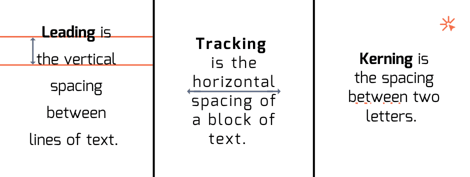
Note that tracking applies equal spacing to letters within a section, while kerning allows you to edit the individual spaces between each pair of letters. It may seem like kerning would make your text appear unbalanced, but good kerning can actually make your text appear more balanced because it is proportional to the varying sizes and shapes of each letter.
- Shape
Shapes are geometric, organic, or abstract forms that make up the non-textual aspects of the design. Almost any object can be represented with basic shapes. For example, a tan-colored triangle with a brown circle on top might remind viewers of a chocolate ice cream cone. Shapes are a simple way of conveying ideas while also making your design more interesting to look at.
Similar to the other elements of design, certain shapes have specific connotations. Sharp, angular shapes such as triangles are associated with alertness and danger, while rounded shapes such as circles bring thoughts of unity to mind. Rigid, boxy shapes such as squares may evoke feelings of security or uniformity.
That’s why it is important to consider how the shapes you use in your design will be perceived by your audience, both consciously and subconsciously.
- Imagery
Images are visual representations of people, places, objects, and ideas. However, it is important to remember that the images you choose for your design will not only represent the things depicted within them but also represent your brand. Let’s say that I made a design with pictures of a coffee shop, people dressed in trendy clothes, the latest computers, and indie record covers. Together, those images will paint a picture of my brand as a brand targeted to hipsters and young adults.

In the same way, you must consider your audience and what appeals to them the most, before connecting those ideas to your brand with a fitting audience. Effective imagery will cause your audience to associate your brand with the things they want.
- Texture
Texture is a visual element that creates a three-dimensional illusion through the use of various artistic tools.
When done well, adding textures to your design will make it more interesting to look at and allow it to hold your audience’s attention for longer. However, when your textures are too distracting, they will overpower the key text and also make your design unpleasant to look at.
It is important to use them in moderation because having too many conflicting textures will also make your design appear overwhelming to viewers.
Similar to imagery, certain textures come with particular connotations. For example, adding a rock or crystal-based texture to your design may cause people to subconsciously associate your design–and perhaps even your brand–with order and stability.
From a broader perspective, the power of design is its ability to use material forms to connect people with immaterial concepts.
Section 5: Putting It All Together In Church Graphics
Now that you have learned the basic elements of church graphic design, we will go over the elements that teach you how to bring everything together.
- Composition
Composition is the process of combining type, images, color, and graphics to form one cohesive design. Similarly to art, some people believe that you either have an eye for composition or you don’t. However, both art and design are skills that can be improved with practice, so don’t worry if you weren’t born with the intuition for it.
As you work on the composition of your church graphic designs, keep these two key concepts in mind:
- Hierarchy
- Guiding the viewer’s eye
- Alignment of elements
- Providing negative space

Get A Proven Marketing Plan That Increases Enrollments When You Book A Call Today!
Receive customized advice to help your school attract more families!
Hierarchy refers to the order in which you want people to look at your design. For example, if you designed a flyer, you may want viewers to look at the event name, then the event details, and finally, the date and time. Hierarchy is primarily indicated through size and color. Bigger, more vibrant text will be seen first.
In the same way, you can use big text, bright colors, and other noticeable elements to create a focal point in your design. Typically, the focal point is the first thing in your design to catch the viewer’s attention. Focal points are one of the most common techniques to guide your viewer’s eye. It is important that you guide your viewer’s eye to ensure that the message of your design gets seen.
Once you have established a focal point, you can move your viewer’s gaze to the next most important section and so on through the use of leading lines. As their name suggests, leading lines are lines that lead your viewer’s gaze along your intended path. However, leading lines don’t have to be lines at all. They can be created with shapes or images that point the viewer in the direction you want them to look.
You can also create leading lines with the alignment of your church graphic design.
Alignment refers to the way you arrange each piece of your design in relation to one another. Good alignment is invisible, but bad alignment will distract viewers from the message of your design. Even if your design is just slightly misaligned, it will leave a negative impression on your viewers whether or not they consciously notice it. When your design is neatly and evenly spaced out, it will give viewers the impression that your brand is professional and capable.
That leads us to the topic of negative space, which is the empty space between elements in a design. Beginner designers might think that the more things they add to their church graphic design, the better the end result will be. However, some of the most memorable designs are very simple ones. Negative space not only gives viewers a place to rest their eyes, but it also helps form groupings and highlight elements.
If there is not enough negative space in a design, the design will feel cluttered, chaotic, and perhaps even anxiety-inducing. This will leave viewers with not only a negative impression of your design but also a negative impression of your brand as a whole.
To avoid creating a design that is ineffective at best, and detrimental at worst, you must keep these points in mind when you work on the composition of your church graphic design.
- Contrast
Contrast is the process of using differences between elements in a design to highlight certain features. This can also be known as breaking the pattern. Think about it this way: if you had a box of eleven blue crayons and one orange one, which one would be the most noticeable one?
Of course, the orange crayon would be the most noticeable because it stands out from the rest. Similarly, you can create a focal point or draw the viewer’s eye by adding an element that stands out from the rest. This can be a shape that is bigger than all the others, a bolded word in a paragraph of normal text, or an image in a different color from everything else.
You must be very intentional about where you place contrast, or else you will only distract your viewers from your message.

Remember not to use too many different elements, or else your design will appear random and uncoordinated. To better understand how to keep your design professional-looking even with the addition of contrast, let’s look at unity in design.

Get A Proven Marketing Plan That Increases Enrollments When You Book A Call Today!
Receive customized advice to help your school attract more families!
- Unity
Unity is the process of using repeated elements throughout to tie your church graphic design together. This means that your design shouldn’t suddenly shift styles midway through (unless you are doing so intentionally to get a certain reaction from your audience).
As aforementioned, a style guide can be helpful in maintaining unity in your design. You should set some fonts for your design along with a color palette of a few matching colors, along with one or two contrasting colors. Use contrasting elements in moderation, while keeping most of the rest of your unified with matching colors, text, shapes, imagery, and textures.
You can also create unity in your design by applying balance. Contrary to what you may expect, things don’t have to be perfectly symmetrical in order to be balanced. Check out the different types of balance in the picture below. Even if they aren’t perfectly even, these designs still appear cohesive because the elements are distributed proportionally to one another.
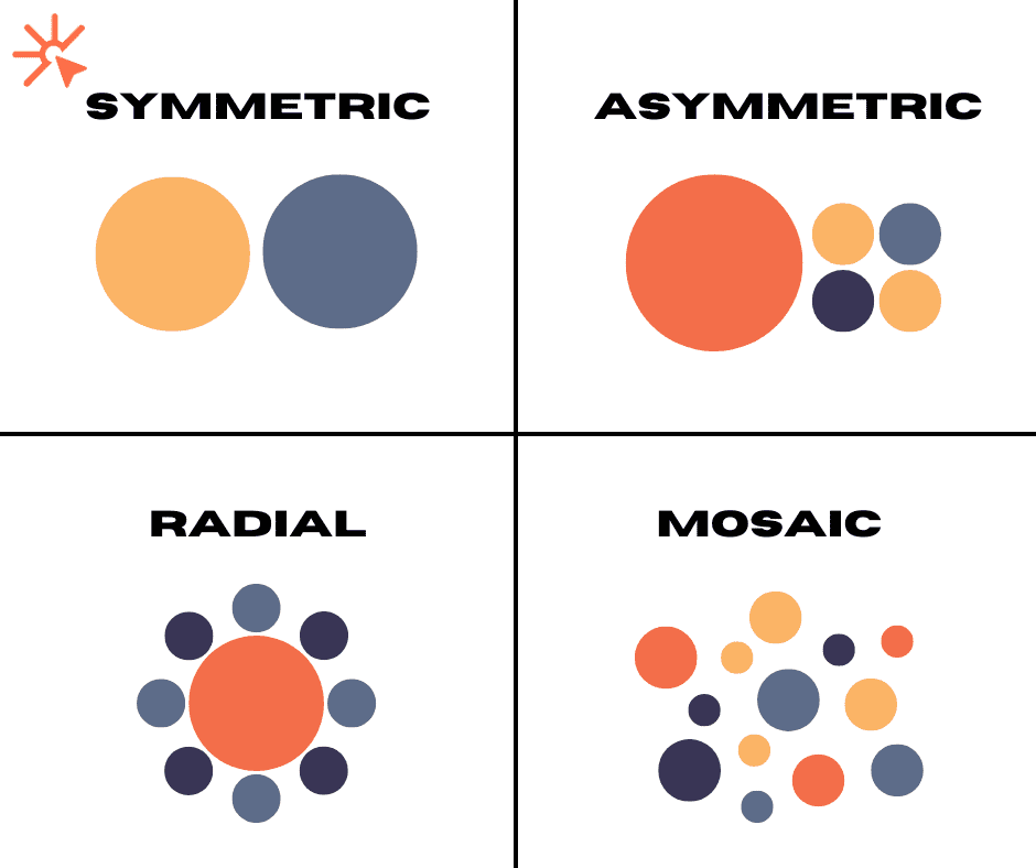
While people generally prefer to look at balanced designs, you can intentionally make an unbalanced design to create a striking or uncomfortable effect when it suits your message.
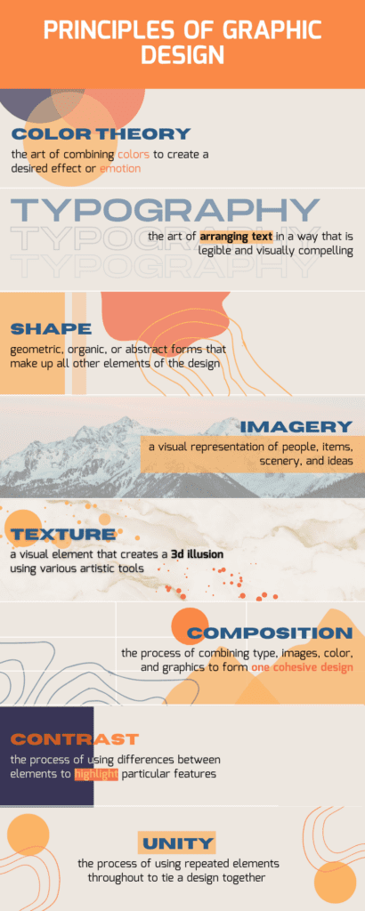
And now you know the basic elements of church graphic design, as well as how they fit together to produce results for your ministry. If you’re concerned about memorizing all of that, don’t worry. We made an infographic to help you recall everything you learned at a glance.
But for all its benefits, is it worthwhile for your church to invest in graphic design?
SECTION 6: When Is Church Graphics Worth The Cost?
Graphic design can be a black hole when it is done aimlessly. One of the last things you want to do with a black hole is to throw your money into it. Unfortunately, this is exactly what many ministries are doing when they invest in graphic design without determining if they will get a healthy return.
You must make sure church graphic design is a wise way to spend your supporter’s money by setting measurable goals you would like to see in your church media ministry.
Christian design companies call these goals Key Performance Indicators (KPIs.)
KPIs are metrics that allow you to compare your results and determine how successful your efforts have been.
For example, if your goal is to make your brand more memorable, you can set a KPI of getting 90 returning users each month. Once the month ends, you can compare how many returning users you actually got to the desired number, and make changes to your church graphic designs to increase effectiveness.
You will need to identify your key performance indicators in advance.
The list of KPIs you can track is huge. It all boils down to your unique situation and the mission of your church.
However, after you have confirmed that church graphic design is a good fit for your church and set KPIs, there is another question you must answer:
Should you outsource your graphic design projects to Christian design companies or do it in-house?
This is one of the questions I receive a lot.
In-house church graphic design relies on an internal team of members from your church, potentially including yourself. If you provide training so that volunteers can develop the skills they want and gain the experience they need, people will want to join your team regardless of pay.
This means that in-house church graphic design can be a very cost efficient option. It also allows you a greater degree of control over the end product, because you will either be working on the design yourself or training the people who will work on it.
While in-house church graphic design costs less in terms of money, it costs more time and effort. Your team will not only have to work toward learning graphic design, but they will also have to work on each project that comes in after they are trained. The other disadvantage of in-house graphic design is that the quality isn’t always on par with professional work. This is understandable because many in-house graphic designers were either self-taught or trained by someone self-taught.

Alternatively, you can hire Christian design companies to do your church graphic design.
Doing this will increase your chances of getting quality work, while also reducing the drain on your time and effort. However, you will only get these benefits if you choose a good Christian design company, and even if you make a good choice, hiring an external business will be more expensive than doing the work in-house.
We recommend doing thorough research on all the companies you are considering and looking at their work portfolios to see if their style is a good fit for your ministry.
To receive further guidance on creating a comprehensive church graphic design strategy, schedule a free strategy session with the banner below.

Get A Proven Marketing Plan That Increases Enrollments When You Book A Call Today!
Receive customized advice to help your school attract more families!
As you are considering which route to take, let’s look at some, tested and proven tools you can use to get started with church graphic design. These tools are helpful if you decide to do in-house graphic design, but they will also give you better insight into what companies are using if you decide to hire a Christian design company.
SECTION 7: Top 5 Free Or Inexpensive Tools For Church Graphic Design
There are lots of tools that can be used to make graphic designs without starting from scratch.

Canva is a web and mobile app you can use to create emotionally appealing graphics that reinforce your church’s mission and purpose. Canva allows you to quickly create stunning graphics. It is practically the “industry standard” for many churches.
Advantages
- Canva is so easy even your Senior Members can use it.
- It has a large library with easy-to-use templates.
- There are templates for anything you might need, such as social media posts, stationery, media, and customized themes.
- The Canva Pro plan is FREE for non-profits with proof of 501c3.
Disadvantages
- There are limitations with the free plan, most notably the need for more ability to use transparency in your exports.
Cost: $0 – $12.95 per user / per month
DesignBold is a church graphic application with some of the most beautiful slide decks online. Your sermon slides will get a serious upgrade when you build them here.
Advantages
- Designbold is an easy-to-use photo editor.
- The application has slide decks that you won’t find anywhere else.
- It offers many visually appealing designs.
- The design themes have several variations, allowing you to easily use one design for multiple platforms.
Disadvantages
- Some layouts and stock photos are locked if you use the free account.
Cost: $0 – $19 per user / per month
With most design tools (such as Canva), you choose a template and fill it in. But RelayThat goes in the opposite direction. You choose what elements you want to communicate, and the tool will create templates around them. If you’re like me, you don’t have time to tinker and find something that looks good. You need a tool to spit out designs on the fly. This is where RelayThat shines.
Input your information and requirements, and then pick the winning design. It’s that simple.
Advantages
- RelayThat is super simple to use. Trust me, it’s hard to mess up a church graphic design here.
- You can create unique projects for all your ministries, giving each one their own look and feel.
- This tool will save you so much time. You can easily get an Instagram graphic created and posted in just a few minutes.
Disadvantages
- You can’t nitpick here. If you want pixel-perfect church graphic designs, or if you already have a layout in mind, the tool won’t allow you the level of customization you want.
Cost: $25 – $97 per month
Pablo by Buffer is a graphic design application that is more straightforward and less complicated than others. If you’re not tech-savvy, or if you prefer to create church graphic designs through your desktop rather than your phone, then this app is for you. Not only can it create church graphics, but Buffer is also a social media scheduling tool.
Advantages
- Pablo by Buffer is easy for beginners to understand and use.
- With this tool, you can create a distinct style for each of your ministries.
Disadvantages
- Some layouts, stock photos, and other premium features are locked if you use the free account.
Cost: $5 – $100 per month*
*This is the price for a Buffer account, which includes other tools besides Pablo.
If you need a comprehensive application for bigger church graphic design projects, such as curriculum, brochures, books, etc, Adobe Indesign is just what you’re looking for.
With Adobe InDesign, you’ll have the best tools at your fingertips to make any publication you want.
Advantages
- Adobe InDesign is included in the subscription you may already be paying for the Adobe Creative Cloud suite.
- The elements within InDesign can be edited using the other Adobe CC apps. In other words, with InDesign, you can Photoshop an image and see the changes in real time.
- The application is a top choice for designing any publications you need. You can do virtually anything with it.
Disadvantages
- Adobe InDesign has a steep learning curve. It is not a graphic design tool you can just jump into without researching prior.
Cost: $21 – $50 per month / per user, depending on the license plan.
In addition to the 5 best church graphic design tools that you can get at a low cost, we will also share with you one bonus free resource: Pexels.
As we discussed in the previous sections, imagery is very important to set the tone and mood of your design. With Pexels, you will be able to access an extensive library of images for every occasion. And all of this can be done without making an account or paying any kind of subscription fee.
Just be careful to stay within Pexels, because there are ads listed there that look like regular images but will actually send you to other sites where the pictures aren’t free to use. Using a copyrighted image (even by accident) can result in costly fees for you and your ministry.
Church Graphic Design FAQS
Church graphic design is the practice of creating visual content to communicate messages and ideas relevant to church activities and values. It’s important because it helps to visually convey the church’s message in an engaging and memorable way, making it more accessible and appealing to a broader audience.
Graphic design enhances church marketing and communication by making information more visually appealing and easier to digest. It can draw attention to important messages, create emotional connections, and help the church stand out in a crowded media landscape.
Key elements include color theory (using colors that evoke the right emotions), typography (choosing fonts that are readable and match the tone of the message), imagery (using photos and graphics that resonate with the audience), and layout (organizing elements in a visually pleasing and functional way).
Developing a strong graphic design strategy involves understanding the church’s audience, defining clear goals for communication, creating a consistent visual style, and regularly evaluating the effectiveness of the designs in conveying the church’s message.
Best practices include maintaining consistency in visual elements across all platforms, ensuring that designs align with the church’s values and message, using high-quality images and graphics, and keeping designs simple and focused for greater impact.
And with that, you’ve gone through the entire ultimate guide to church graphic design. Now it’s time for you to use what you’ve learned to re-energize your ministry brand!
Which element of church graphic design stood out to you the most? Let us know in the comments.

Responses