
A good school website should grab the attention of future families, show what the school stands for, and keep people engaged. To do that, the site needs to be easy to use, work well on phones, load fast, and be simple to move through. Strong, honest visuals help build trust. When the design is done right, it helps bring in more students and supports the school’s goals with a smooth online experience.
Key Takeaways
- Good web design can make a big difference for school sites. Nearly half of visitors say design helps them trust a site, so strong design can boost both sign-ups and user interest.
- Give your users what they need by keeping menus simple and using an easy content system. This lets each team update the site without needing tech skills.
- Make your homepage and landing pages clear and easy to follow. A strong layout helps guide users and can raise application rates by 20–30%.
- Don’t forget mobile users. A site that works well on phones not only keeps users happy but also helps your site show up higher in search results.
- Strong, clear buttons and links (CTAs) can help more people take action. Put them in the right spots and use clear words to help guide future students toward signing up.
What Makes Web Design Crucial for Educational Sites?
Is your school’s web design for educational sites helping or hurting your enrollment?
Whether you run a private school, a Christian academy, or a large learning center, your site is now your front office.
And it’s always open.
It’s often the first thing families see.
Good design does more than look nice—it helps parents and students find what they need and move one step closer to enrolling.
Most families check out your school online well before they book a tour.
A smart site answers their questions fast, builds trust, and shows what your school stands for.
It doesn’t just say your school is great—it proves it.
Studies show that strong website design is a top factor in how people judge a site’s credibility.
That’s a big deal when you’re trying to stand out in a crowded school market.
Good web design for educational sites builds trust, keeps people on your site longer, and backs up the solid work you do in person.
When families compare schools, trust and clear info win.
Let your site do some of the work for you.
Understanding Your Educational Audience’s Needs
When it comes to web design for educational sites, knowing who you’re speaking to is key.
Parents, students, and school staff all visit your site for different reasons.
If your site doesn’t give them what they want fast, they’ll leave.
Parents look for info on classes, school values, and easy ways to book a tour.
Students want to see what life is like at school—clubs, sports, and photos that feel fresh and real.
Staff needs quick ways to update calendars, post news, or manage faculty pages.
That’s why we suggest using systems set up for each group.
These tools let each team post updates without dealing with tech stuff.
Simple menus and quick links to the right info are a must.
We design with that in mind—helping users move smoothly from one step to the next.
When your site works the way people expect, they stay longer and find what they need.
The goal? Build trust, meet real needs, and keep your site current.
That’s what good web design for educational sites is all about.
Clear pages and simple menus help your school’s strengths stand out without extra clutter.
We help private and Christian schools clean up their site flow and shine a light on what’s most important.
When your layout drives what users do, you stop missing chances and start making real online connections.
A better site layout leads to better results — that’s the aim.
Visual Branding That Builds Trust
When it comes to web design for educational sites, first looks matter a lot.
Your website is often the first thing a parent or future student sees.
The feel, look, and layout say a lot before anyone reads a word.
Strong visual branding isn’t just nice to have—it helps build trust right away.
Your school’s vibe, values, and story should come through clearly in the design.
Using the same colors, fonts, logos, and voice across the site helps tell users who you are.
It also makes your site feel stable and familiar, which helps people feel more confident.
A clear and steady look makes people want to stay longer and come back.
But looking good isn’t enough on its own.
The pictures you choose are just as key.
Real shots of your classrooms, students, and events bring your site to life.
They help people feel what your school is all about.
In the end, strong web design for educational sites should feel like a walk through your halls—warm, open, and full of hope.
That’s what we build with you.
If your site doesn’t earn trust in the first few seconds, you could miss out on new students.
Let’s fix that—step by step, with care and style.
Mobile Optimization is Non-Negotiable
These days, parents check out schools while waiting in the carpool line, so mobile optimization isn’t optional—it’s a must.
Over 60% of traffic to educational websites now comes from phones and tablets.
If your site isn’t built for mobile, you’re losing families before they even get to the second line.
When it comes to web design for educational sites, a responsive layout keeps your school’s message clear and easy to read, no matter the screen size.
It’s not just about shrinking your desktop view.
It means reworking how info flows, making menus easy to use, and making buttons big enough to tap without zooming in.
A mobile-first design also helps you rank better in search results.
Clean, simple mobile design also keeps people engaged during the application process.
Easy-to-use mobile forms, progress bars, and save-and-continue features cut down on confusion and help keep folks from dropping off.
Bottom line—mobile optimization affects how people see your school, how they interact with your site, and whether they apply.
If your site doesn’t work well on a phone, it’s hurting your chances.
Let’s fix that—Clickmill.co is here to help.
Speed Matters: Site Performance for Better UX
These days, speed counts.
A slow site isn’t just a hassle—it drives people away.
If your web design for educational sites isn’t built for speed, you could be losing families before they even see what your school offers.
Just a one-second delay can cause a big drop in engagement.
People expect fast sites.
When parents check out schools, they want quick access to forms, class info, and contact details.
If your pages lag, it gives the wrong impression—even if your school is great.
We use tools to spot what’s slowing things down, like large images or messy code.
Then we clean it up.
Fast load times come from smart code and light files.
It’s not just a nice touch—it’s what users expect.
Whether folks visit on a phone or tablet, we make sure your web design for educational sites works fast and smooth.
When your site runs well, your message comes through—so more families see what you offer.
A clear and simple site layout helps both users and search engines.
You need on-page SEO strategies that speak to what parents are looking for—like “top Christian private school near me” or “faith-based education.”
Clean code and the right use of headings also help search engines know what your site is about.
Crafting Content That Converts

Let’s be real—nice-looking sites are fine, but sites that work make all the difference.
If your school’s site isn’t answering parent questions, showing how students benefit, or making sign-ups easy, you’re likely missing out.
Great web design for educational sites is more than looks—it’s about clear, persuasive copy that connects with both parents and students.
At Clickmill.co, we build content that works.
It’s not just there to fill space—it’s made to help visitors take action.
Whether that’s booking a tour, grabbing a course guide, or asking about admissions, every word should guide them forward.
Calls to action should feel natural and help users move without friction.
We focus on storytelling that shares what makes your school special—your values, your vibe, and what life is like for students.
With tight, focused content built to convert, you’ll likely see more clicks, more interest, and more sign-ups.
Parents don’t have time to waste.
They skim, scan, and hope to feel sure fast.
That sense of trust? It starts with simple, clear, and right-on-target words.
When done right, they turn readers into leads—and leads into new students.
Let’s make it easier for them to say yes.
Accessibility Drives Inclusion and Compliance
In web design for educational sites, one thing should never be skipped: accessibility.
At Clickmill.co, we believe all students, parents, and teachers should have an easy time using your site—no matter their abilities or what device they use.
Making a site ADA-compliant isn’t just a task to check off—it’s a way to reach more people and show that your school cares about inclusion.
Think about this—a parent with low vision can’t fill out your form, or a student can’t get through a class page without a mouse.
That’s a missed chance to connect.
We build layouts that are easy to use, with good contrast, image text, and keyboard-friendly paths so that everyone can use your school’s site.
Accessibility also helps with meeting legal rules.
Without it, your school might face legal risks.
But more than that, accessible design sends a clear message—your school is open, warm, and welcoming.
That means a lot to families who want schools that match their values.
We use real-world tests and tools like WAVE and Axe to make sure your site is more than just compliant—it’s usable.
When it comes to web design for educational sites, accessibility isn’t just needed—it’s smart.
Let’s create a site that supports your mission and makes space for everyone.
Integrating Educational Tools Seamlessly
A school website needs to do more than look good—it has to work well, too.
One thing often missed in web design for educational sites is how well tools like forms or calendars blend into the site.
These tools should feel built-in—not like clunky extras that throw off the look or confuse users.
Parents, students, and staff go to your site for different reasons.
Some want to check the school calendar, others need to apply or log in to a portal.
If your site doesn’t work smoothly, people may give up, miss deadlines, or not enroll at all.
That’s why we focus on tools that are easy to use and fit your school’s needs.
Things like secure document uploads, payment tools, and links to learning or student info systems aren’t just nice to have—they’re must-haves.
These features save time for your team and also show tech-savvy families that your school is well-run.
And the best part?
You don’t have to give up good design to get this right.
With our method, your web design for educational sites stays clean and easy to use—while making sure everything works just how it should.
Leveraging Conversion Optimization Techniques
When it comes to web design for educational sites, conversion optimization is a must.
If you want more families to reach out, book a tour, or apply online, your site needs to be built with trust, clear steps, and strong calls to act.
First, ask yourself: does your school’s site look trustworthy right away?
If not, you might be losing interested families.
Adding signs of trust—like school accreditations, awards, or ties to known groups—can help parents feel at ease.
It also helps to show notes from school leaders or highlight your school’s values.
These touches build a real, human link.
Clickmill.co helps private and Christian schools create trust and make signing up simpler.
One way is by using a step-by-step application process with visual cues to show progress.
It’s a smart tweak that makes the path clear and cuts drop-offs.
We also test key things like sign-up buttons and landing pages, so your site won’t just look good—it will get results.
Our method for web design for educational sites is sharp, hands-on, and aimed at what works.
If you’re done guessing and ready to see real changes, let your website take on the hard work.
What changes have you made to your school’s website that helped boost inquiries or applications?
Calls-to-Action That Actually Work
Let’s be honest—your site might have the sharpest web design for educational sites out there, but if your calls-to-action (CTAs) are hard to find, dull, or unclear, you’re losing families at the last step.
All that good design and strong content? It’s there to push people to do something.
That’s where we help.
Where you place CTAs matters a lot in school marketing.
They should be above the fold on your homepage, inside pages about enrollment, and at the end of blog posts—leading visitors down a clear path.
We create CTAs that feel easy and natural, not pushy, and guide people along without friction.
Even more important, your CTAs should fit your school’s real goals.
Whether you want to book campus tours, get more applications, or get parents to download your handbook, we shape each CTA to move people where you need them to go.
And we don’t stop there.
Strong educational website design should also include follow-up tools.
That means confirmation emails, event notes, and drip messages to keep people engaged and cut down on fall-offs.
These aren’t nice-to-haves—they’re key parts of great web design for educational sites.
Bottom line? We don’t just hope people engage.
We build smart, high-performing paths that make the next step easy.
Let’s make something that truly works.
Common Design Mistakes to Avoid
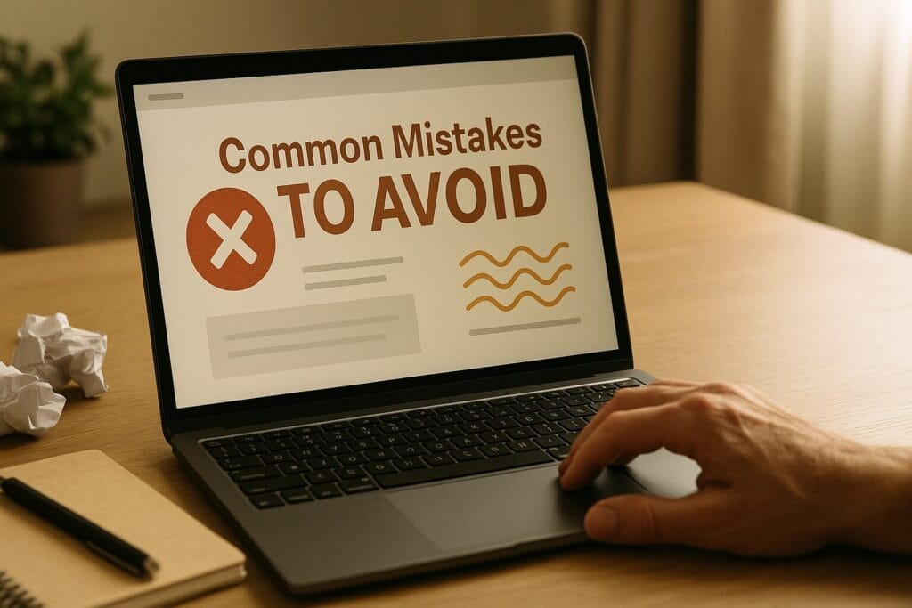
Let’s face it—web design for educational sites can be tough.
Schools aren’t just like any other place—they’re tight-knit communities with big needs for both how things look and how they work.
Still, many schools fall into the same traps.
First up: using too many stock photos.
All those stock shots of smiling kids and “diverse classrooms”? They’re everywhere.
If your site looks like all the others, parents might think your school is just as plain.
Use real photos from your school instead.
Real moments build trust.
Another big mistake: hard-to-follow menus.
If key info like how to enroll or how to contact you is buried in a bunch of clicks, you’ll lose people.
A parent shouldn’t have to dig around to find your admissions page.
The layout should be clear and easy to use so visitors can find what they need fast.
Then there’s the no-phone plan.
Many school sites still aren’t made for mobile, and that’s a big problem.
Skip ADA rules, and it’s even worse.
Lots of families check school sites on their phones.
If your site doesn’t work well for them—or for folks with different needs—you might lose those visitors for good.
You could even face legal issues.
Also, don’t flood every page with calls-to-action (CTAs).
Putting “Apply Now,” “Learn More,” and “Contact Us” all over the place won’t help.
When everything shouts at once, nothing gets heard.
Place CTAs where they make sense, when users are ready to act—that’s how you get results.
Skip these common mistakes, and your web design for educational sites could go from slowing you down to helping you grow.
Want an expert design audit? Reach out to Clickmill.co today.
Finding the right partner for your school’s site can be tough—especially when it comes to web design for educational sites.
You don’t just need someone who can build a website.
You need a team that knows private school marketing, understands enrollment goals, and gets what makes Christian education different.
Frequently Asked Questions Section
Every private school website should do more than just show off the school—it should help bring in new families and keep current ones informed. At the very least, it should have clear menus, work well on phones, show off your school’s vibe with good photos, and guide users to book a tour, apply, or reach out. A good content system that’s easy to update is a must. You’ll also need built-in tools like event calendars, parent and student portals, and ways to upload files safely. When it comes to solid web design for educational sites, these features help connect your site to real-world results.
It depends on what each school needs and how much content you already have, but most school website projects take 8 to 14 weeks. It’s not just about looks—it takes research, planning, and a design that fits your enrollment goals. At Clickmill.co, we take time to learn about your school, who you’re speaking to, and what matters most. We focus on phone-friendly layouts, easy user stuff, and the SEO basics that help people find you. A smart web design for educational sites can really pay off by helping you meet your enrollment goals.
A good site works for you all day, every day. When done right, it builds trust, shows what your school stands for, and walks families through the steps to enroll. Easy menus, step-by-step forms, and clear messages all help families feel confident. Schools that focus on pages that convert interest to action often see more sign-ups. So yes, strong web design for educational sites plays a big part in turning visitors into enrolled students.
What would you like to see in a modern school website? Share your thoughts below!

Responses